Ivonne Ramirez
Case Study

Redesigning Flight Disruption Recovery

Redesigning Flight Disruption Recovery
Overview
Role
Primary UX Designer
Company
United Airlines
Timeline
July 2023 - February 2024
Team
2 UX Designers, Mobile App Product Managers, Development Team, Airport Operations Stakeholders
Tools
SketchFigjamUserTesting.com
Platforms
iOSAndroidMobile WebDesktop
The Challenge

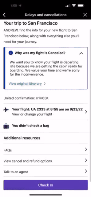
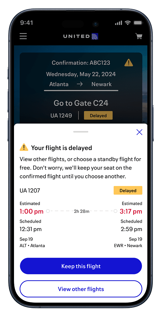
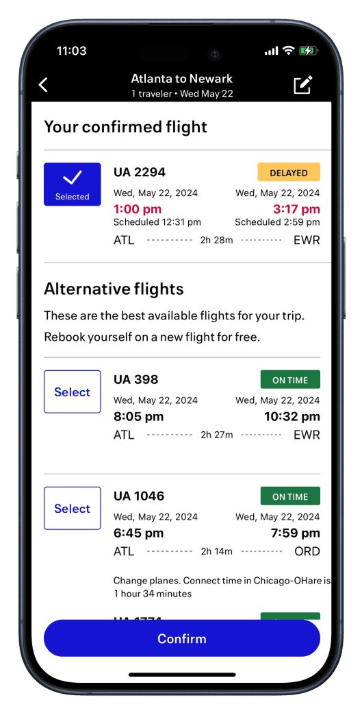
When flights are cancelled or delayed, passengers need to rebook quickly—but they don't trust the self-service options in United's mobile app. Instead, they turn to Google Flights or wait for an agent to help. This creates friction at the worst possible moment and overwhelms the contact center with rebooking requests that could be handled in-app.

The original rebooking experience was confusing, lengthy, and lacked clear guidance.

Key Pain Points

Customer Frustrations During Flight Disruption
Unclear where to start rebooking their flight
Current process requires 10+ steps—lengthy and confusing
Don't understand what standby is or how to add it via app
Don't trust the rebooking options shown in the app
Overwhelmed by contradicting alerts and notifications
Research & Discovery

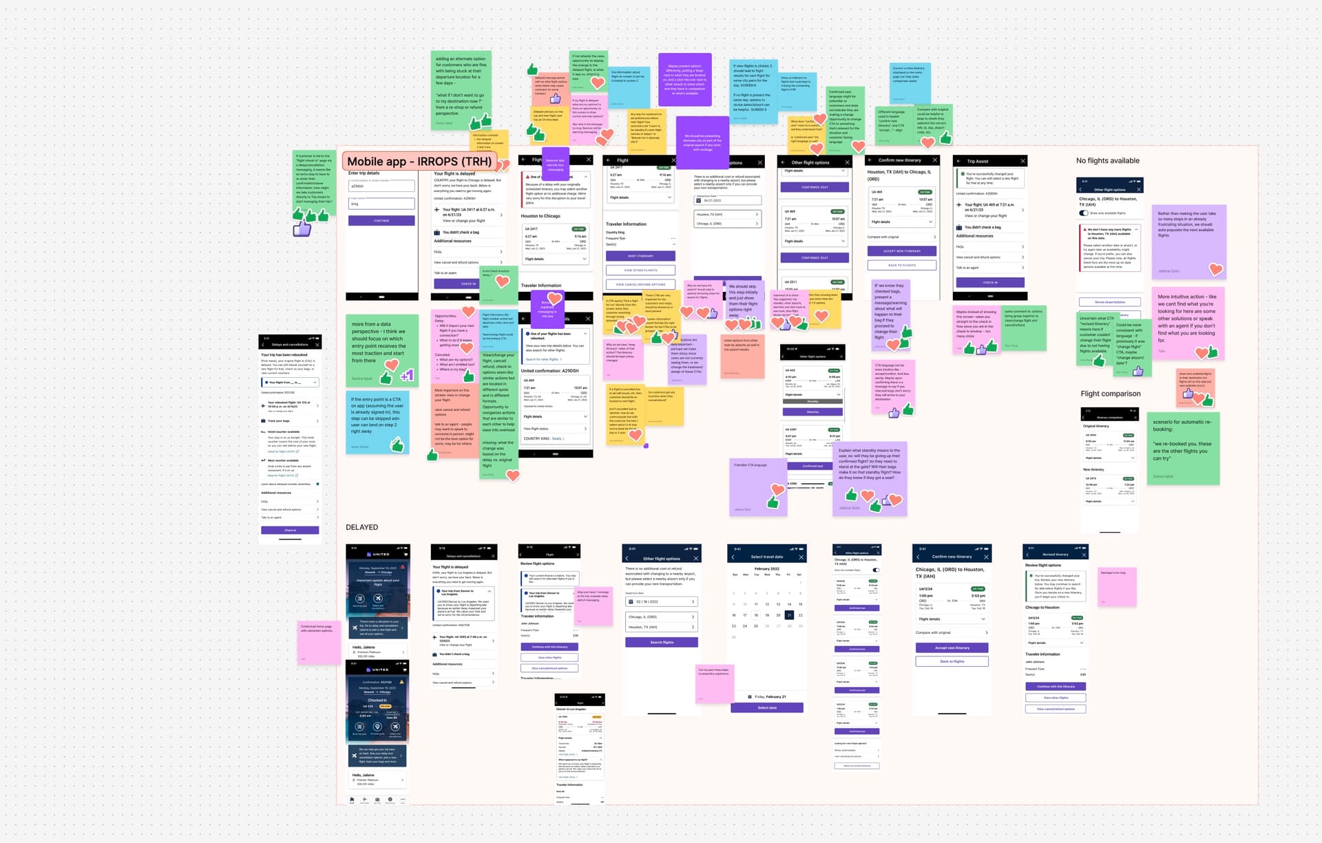
Before diving into design, I collaborated with my principal designer and UX research team to establish clear design goals. We developed several "How might we" statements to frame our problem-solving:

  • How might we streamline the re-shop flow to assist customers faster?

  • How might we improve communication during disruption?

  • How might we provide peace of mind about baggage?

  • How might we help customers understand all available options?

  • How might we make self-service intuitive to reduce contact center calls?

The Design Dilemma

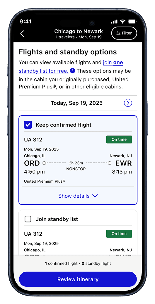
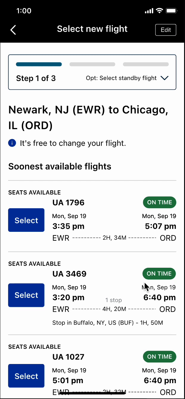
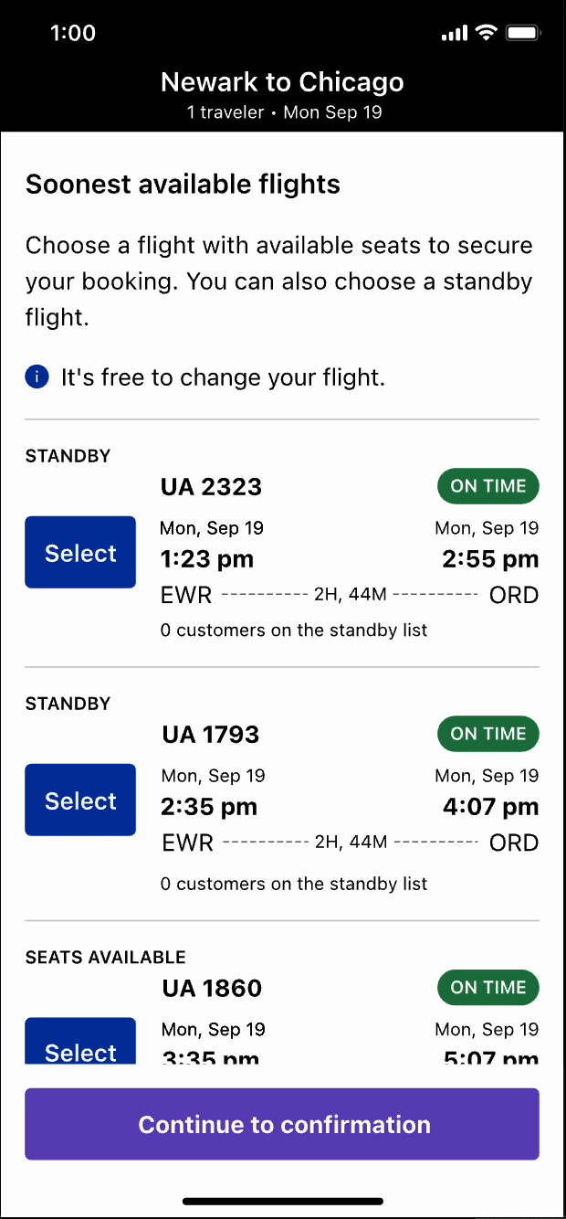
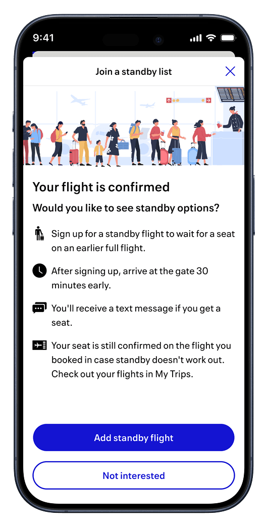
Our leadership wanted all rebooking options (confirmed flights and standby) displayed upfront on a single screen. However, from a technical perspective, the system required customers to first confirm a flight before adding themselves to standby, making a mixed layout more complex than linear.

Rather than argue against leadership's vision, I advocated for bringing in the customer's voice through A/B testing. My principal designer supported this approach, and we partnered with our research team to validate which design customers actually preferred.

Affinity mapping and research synthesis across the IRROPs redesign exploration.
A/B Testing: Design A vs. Design B

We conducted an unmoderated concept test with 16 United passengers who had experienced flight changes or cancellations in the past 6 months using UserTesting.com.

Design A (Linear)
A step-by-step approach in which customers first select a confirmed flight and then have the option to add standby flights. This follows the technical system flow and
Design A walkthrough
Design A (Linear) - Step-by-step rebooking flow
Design B (Mixed)
All options (confirmed and standby) are displayed together on one screen, leadership's preferred approach for showing comprehensive choice upfront.
Design B walkthrough
Design B (Mixed) - All options displayed together

Key Research Insights

0%
Found both concepts easy to use and intuitive
0%
Noticed the difference between confirmed and standby
0traveler
Missed the distinction and would have chosen based on flight time alone

It's incredibly helpful and shortens the process to rebook without the need to wait on hold to speak to an agent.

United Passenger
Research Participant

I like the idea of having a backup flight in the event it's canceled AGAIN. However, the overall verbiage is vague and doesn't provide much help.

United Passenger
Research Participant

Critical Finding

Need for Stronger Visual Signals
While most travelers understood the difference between confirmed and standby seats, they were surprised by the standby options and sometimes missed the headers. This revealed the need for stronger visual differentiation and clearer messaging to prevent confusion.
The Final Design Solution

Armed with research insights, we moved forward with Design A (linear approach) but enriched it with clearer messaging and visual signals. The key improvements:

1
Clear Notification Drawer
When a flight is impacted, customers see a prominent drawer explaining their situation and available options before launching into the rebooking flow.
2
Reduced Step Count
From 10+ steps down to just 5 clicks—customers can now rebook in a fraction of the time.
3
Visual Progress Indicators
Step counters (Step 1 of 3, Step 2 of 3, etc.) guide travelers through the process and set expectations.
4
Distinct Section Headers
Clear separation between 'Confirmed Flights' and 'Standby Flights' prevents confusion and helps customers understand their options.
5
Contextual Education
Inline help text explains what standby is and how it works, building confidence in the options.
New experience: Clear flight options with status badges
Final confirmation screen showing confirmed and standby selections
Standby signup explanation with clear next steps

Stakeholder Buy-In

When I presented the research insights to leadership, they immediately understood why the linear approach was superior. The customer voice made all the difference—showing that real travelers preferred clear messaging and guided steps over information overload. This shifted the conversation from 'what we think is best' to 'what customers actually prefer.'

Results & Impact

Redesign launched on the mobile app in late January 2024, alongside mobile web and united.com. The improvements have been performing beautifully, with customers increasingly self-servicing and trusting the app's recommendations.

0%
Customers self serviced prior to the redesignetric
0%
New mCustomers self serviced after to the redesignetric
Sharing the case study at United's UX Day 2024.
Key Learnings

This project taught me the power of bringing customer research into difficult conversations. When stakeholder vision conflicts with design intuition, the answer isn't to argue harder—it's to test with real users. The data from just 16 passengers was enough to shift an entire organization's direction.

I also learned that this was far from a one-and-done deliverable. Since launch, we've continued to refine the experience, add edge cases, and expand the foundation we built. The work continues as we explore additional disruption scenarios and expand self-service capabilities.

January 2024: Initial release
January 2026: Standby and confirmed flights displayed together

Next Project

Busyness in Apple Maps

View project